A form input that enables users to select one or more files from their local device for upload.
Usage
The File Input component uses the native HTML input with type="file" under the hood but adds visual styling to match other HDS components.
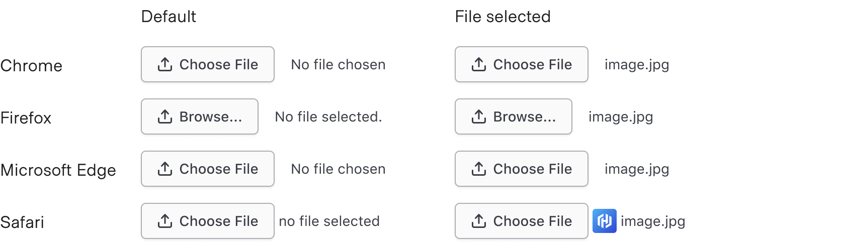
Browser inconsistency
Because the File Input is based on the native HTML input, the content and visual appearance may vary slightly across browsers.
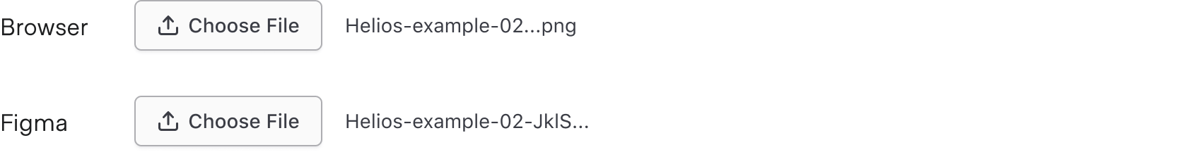
Truncation
Truncation is built into the native component and uses the width of the container to determine when the text gets truncated. It is not based on a character limit.
Due to limitations in Figma, truncation will occur at the end of the text, while in the browser, truncation occurs in the middle.
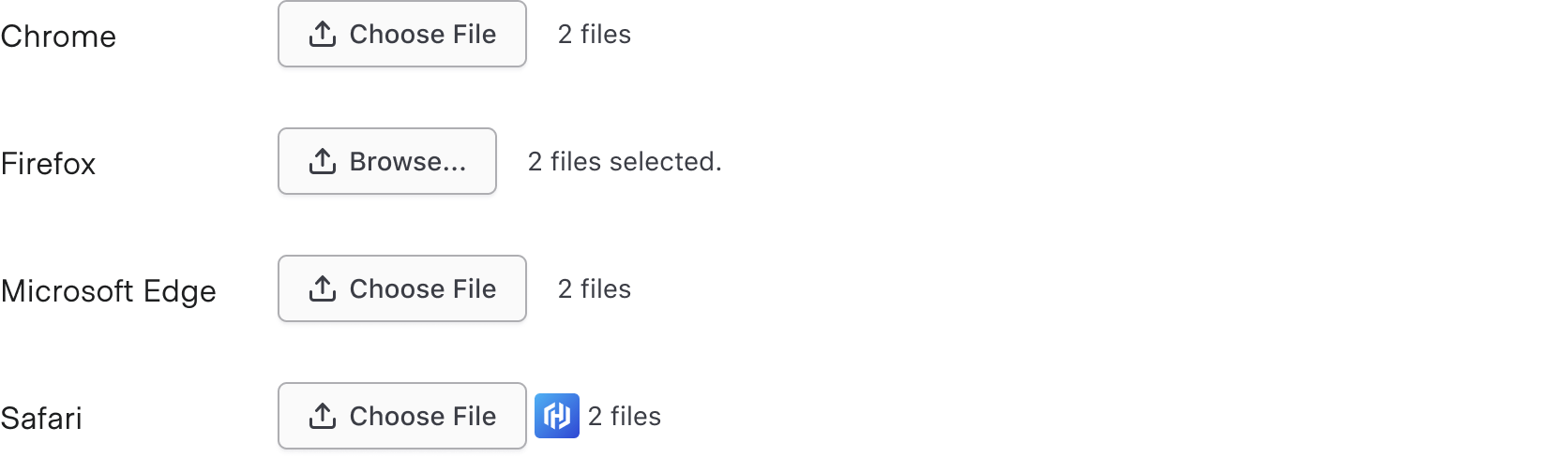
Multiple files
Multiple files can be added at once when the multiple attribute is enabled in code. When more than one file is selected, the text will change to show the number of files you’ve selected, e.g., “2 files”. The exact language used may differ between browsers.
How to use this component
The File Input component uses the native HTML input with type="file" under the hood but adds visual styling to match other HDS components.
There are two ways to use the File Input component:
Form::FileInput::Base—the Base component: just the <input type="file"> control.
Form::FileInput::Field—the Field component: the <input type="file"> control, with label, helper text, and error messaging (in a wrapping container).
We recommend using the Field component as it provides built-in accessibility functionality. Use the Base component if you need to achieve custom layouts or for special use cases not covered by the Field component.
Form::FileInput::Field
<Hds::Form::FileInput::Field name="demo-profile-photo" as |F|>
  <F.Label>Upload a file</F.Label>
</Hds::Form::FileInput::Field>
Helper text
You can add extra information to the field using helper text. When helper text is added, the component automatically adds an aria-describedby attribute to the input control, associating it with the automatically generated ID of the helper text element.
File size should be a maximum of 2 MB.
<Hds::Form::FileInput::Field name="demo-profile-photo" as |F|>
  <F.Label>Upload a file</F.Label>
  <F.HelperText>File size should be a maximum of 2 MB.</F.HelperText>
</Hds::Form::FileInput::Field>
Extra content in label and helper text
If a link is used within a label, helper text, or error text, it will not be presented as a link to the user with a screen reader; only the text content is read out. As such, care should be taken when considering this feature. If you do need to include a link, include a screen reader-only message that informs the user that some help text includes links, and additional keyboard exploration may be required.
The Label and HelperText contextual components used in the Field component yield their content. This means you can also pass structured content.
<Hds::Form::FileInput::Field name="demo-profile-photo" as |F|>
  <F.Label>Upload a file <Hds::Badge @size="small" @text="Beta" /></F.Label>
  <F.HelperText>This is an <Hds::Link::Inline @href="#">experimental feature</Hds::Link::Inline>.</F.HelperText>
</Hds::Form::FileInput::Field>
Required vs. optional
Use the @isRequired and @isOptional arguments to add a visual indication that the field is "required" or "optional".
File size should be a maximum of 2 MB.
The page navigation is complete. You may now navigate the page content as you wish.
A form input that enables users to select one or more files from their local device for upload.
Usage
The File Input component uses the native HTML input with type="file" under the hood but adds visual styling to match other HDS components.
Browser inconsistency
Because the File Input is based on the native HTML input, the content and visual appearance may vary slightly across browsers.
Truncation
Truncation is built into the native component and uses the width of the container to determine when the text gets truncated. It is not based on a character limit.
Due to limitations in Figma, truncation will occur at the end of the text, while in the browser, truncation occurs in the middle.
Multiple files
Multiple files can be added at once when the multiple attribute is enabled in code. When more than one file is selected, the text will change to show the number of files you’ve selected, e.g., “2 files”. The exact language used may differ between browsers.
How to use this component
The File Input component uses the native HTML input with type="file" under the hood but adds visual styling to match other HDS components.
There are two ways to use the File Input component:
Form::FileInput::Base—the Base component: just the <input type="file"> control.
Form::FileInput::Field—the Field component: the <input type="file"> control, with label, helper text, and error messaging (in a wrapping container).
We recommend using the Field component as it provides built-in accessibility functionality. Use the Base component if you need to achieve custom layouts or for special use cases not covered by the Field component.
Form::FileInput::Field
<Hds::Form::FileInput::Field name="demo-profile-photo" as |F|>
  <F.Label>Upload a file</F.Label>
</Hds::Form::FileInput::Field>
Helper text
You can add extra information to the field using helper text. When helper text is added, the component automatically adds an aria-describedby attribute to the input control, associating it with the automatically generated ID of the helper text element.
File size should be a maximum of 2 MB.
<Hds::Form::FileInput::Field name="demo-profile-photo" as |F|>
  <F.Label>Upload a file</F.Label>
  <F.HelperText>File size should be a maximum of 2 MB.</F.HelperText>
</Hds::Form::FileInput::Field>
Extra content in label and helper text
If a link is used within a label, helper text, or error text, it will not be presented as a link to the user with a screen reader; only the text content is read out. As such, care should be taken when considering this feature. If you do need to include a link, include a screen reader-only message that informs the user that some help text includes links, and additional keyboard exploration may be required.
The Label and HelperText contextual components used in the Field component yield their content. This means you can also pass structured content.
<Hds::Form::FileInput::Field name="demo-profile-photo" as |F|>
  <F.Label>Upload a file <Hds::Badge @size="small" @text="Beta" /></F.Label>
  <F.HelperText>This is an <Hds::Link::Inline @href="#">experimental feature</Hds::Link::Inline>.</F.HelperText>
</Hds::Form::FileInput::Field>
Required vs. optional
Use the @isRequired and @isOptional arguments to add a visual indication that the field is "required" or "optional".