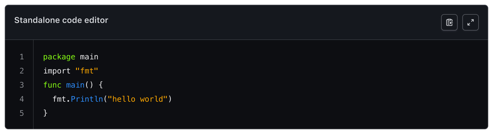
The Code Editor is used to edit formatted code. It supports syntax highlighting, auto-closing brackets and quotes, and a custom yielded section for additional functions.
Usage
When to use
- When a user needs to create code from scratch.
- When code requires modification from an existing source.
When not to use
- As a read-only reference for code, use the Code Block instead.
Standalone
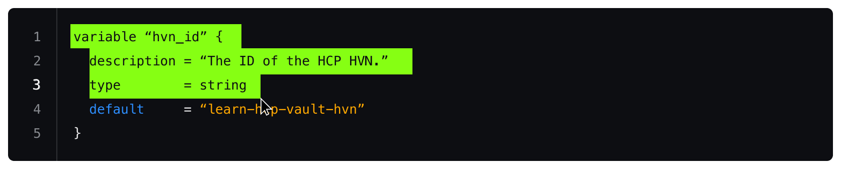
The isStandalone property increases the portability of the Code Editor to ensure that it can be used in different contexts. A common use case of the Code Editor is in a “standalone” context, which can be part of a form or multi-step process and is generally a part of the normal layout flow.
Sometimes it may be necessary to use the Code Editor in a more dense layout or nested within another component.
Header
An optional header is available within the Code Editor. It consists of three sections that can be toggled as needed:
- the text content that includes the title and description
- an actions container for secondary actions
- a custom content section for adding primary actions
When to use a title and description
A title and description provides additional contextual information for the Code Editor. An accessible name is mandatory and can either be provided by the title or by an external text element.
Provide an accessible name for the Code Editor so that users of assistive technology can understand its purpose.
Don't assume all users will understand the purpose of the Code Editor without providing an accessible name. Not providing one may cause confusion and is an accessibility failure.
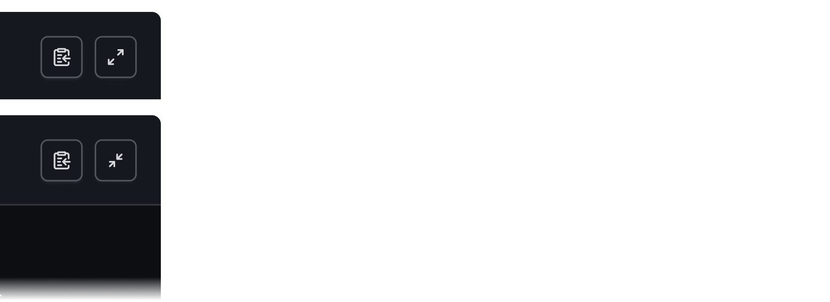
Secondary actions
The secondary actions section supports two optional buttons: the Copy Button, and a “full screen” button. The Copy Button copies the content of the Code Editor to the clipboard, while the full screen button toggles the size of the Code Editor from inline view to full screen.
Custom actions
Custom primary actions can be added to the header. Primary actions include those necessary for the user to complete their work.
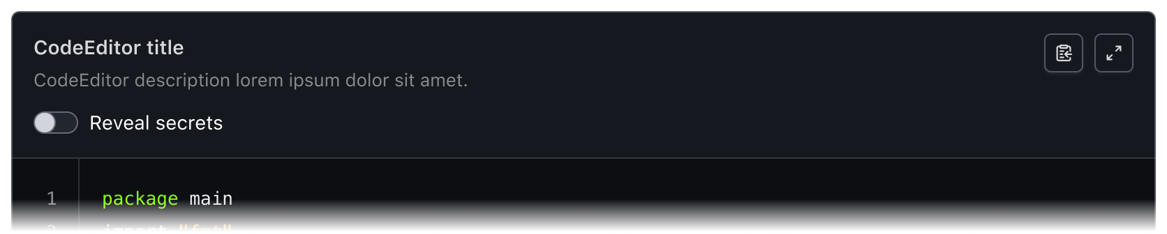
Here is an example of a custom action to reveal secrets.

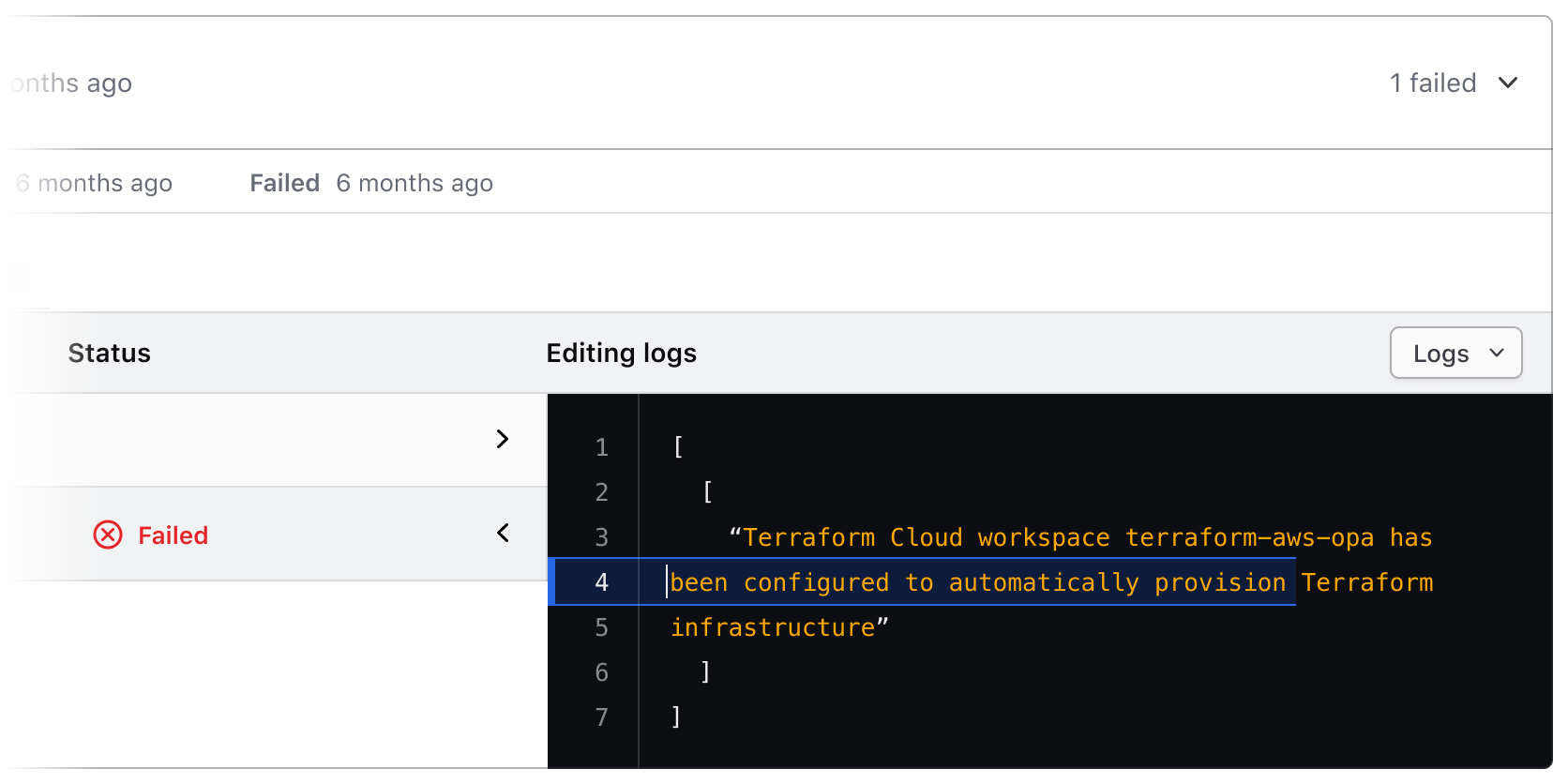
External elements
Some elements or functions outside the Code Editor may affect the content within the Code Editor. In this case, we recommend turning off the header to visually couple the editor with the nearby controlling elements.
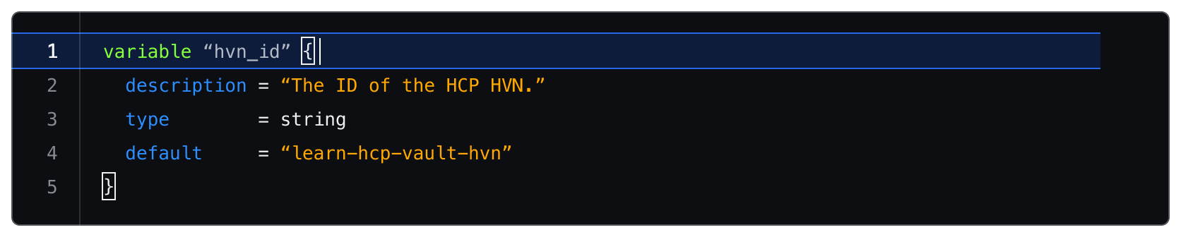
Active line highlighting
When a user edits a line of code, a highlight will display to show their location within the Code Editor.
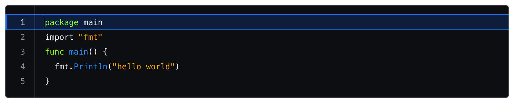
When a user selects a piece of code, the active line highlight no longer displays although the line number of the last line of the selection will be highlighted.
Bracket highlighting
The Code Editor automatically closes open quotes and brackets as the user types. When the user’s cursor is next to a bracket, the bracket will highlight to show the start and end of the pair.
Language
Language determines how syntax highlighting is applied and formatted within the editor but is handled a bit differently between the Ember and Figma components.
The Ember component uses CodeMirror to handle syntax highlighting and comes with a pre-defined set of languages.
In Figma we provide a handful of example languages intended as visual examples. Syntax highlighting in Figma is a non-trivial process and requires the manual application of color styles to each “type” of code. You are still able to add a custom code snippet to the Figma component by typing/pasting into the text layer, but syntax highlighting will not be automatically applied.
Applying syntax highlighting
If you wish to create custom examples using the Code Editor, we publish all of the relevant syntax highlighting variables in the HDS Components v2.0 library. However, due to the number of languages supported by the component, the color variables use a generic naming schema (e.g., cyan, red, purple) to remain as agnostic as possible when being applied to different languages. For more details around syntax, visit the specifications.
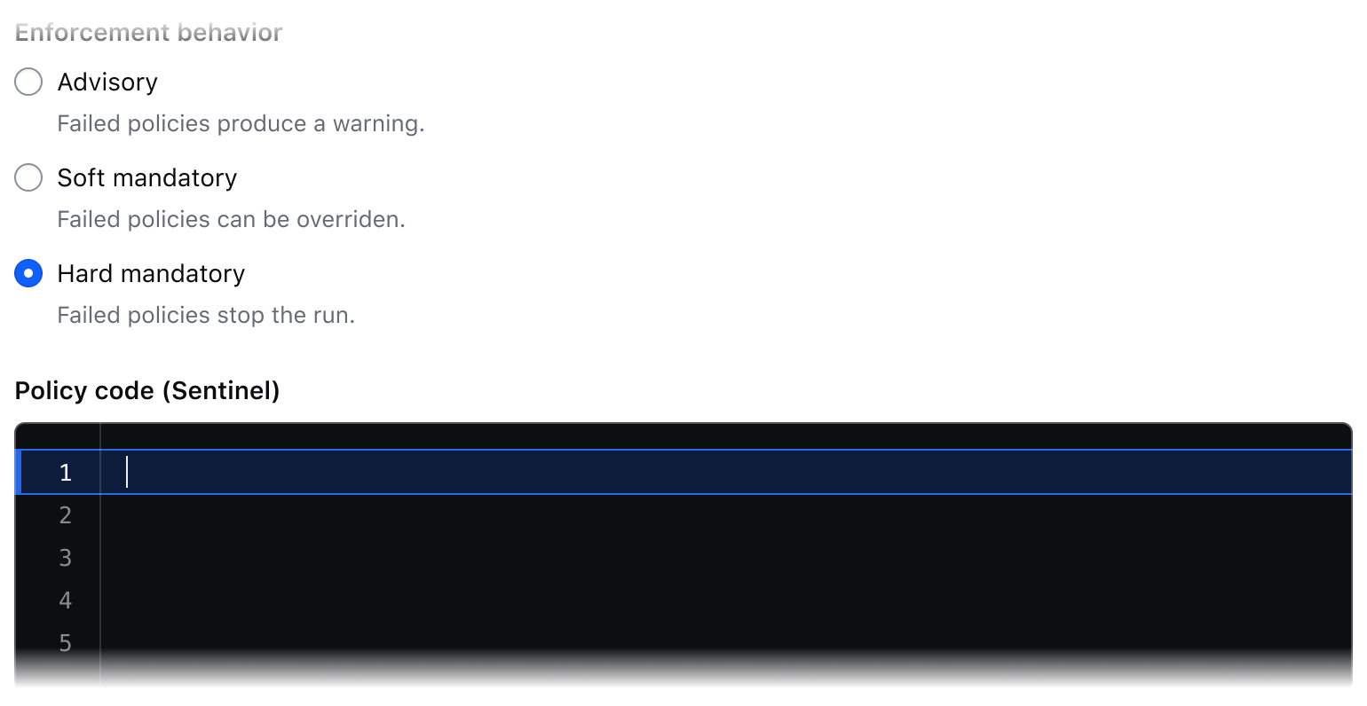
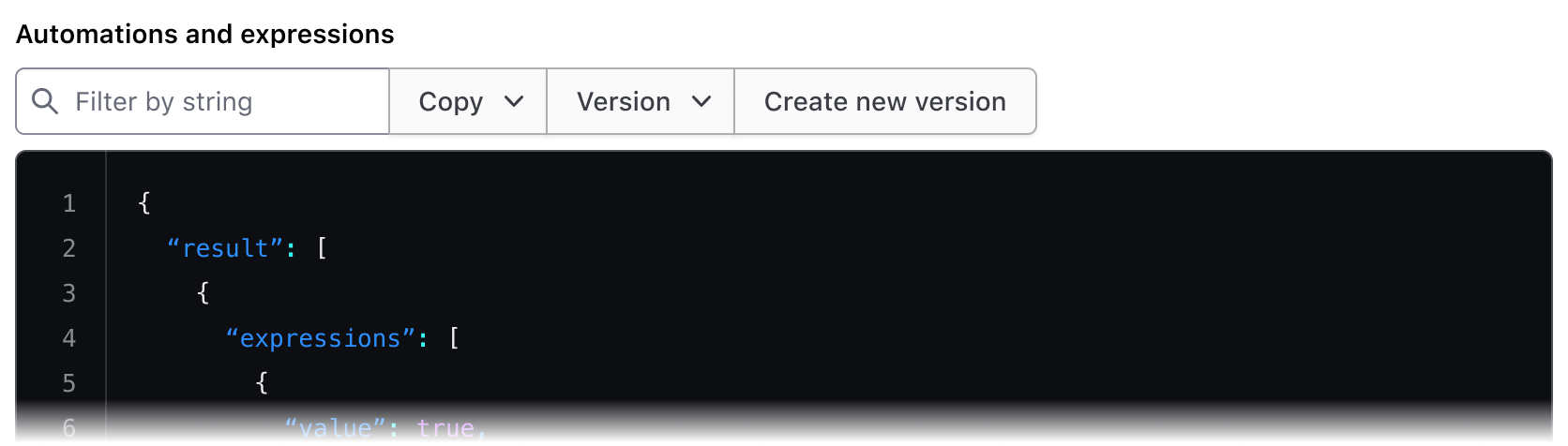
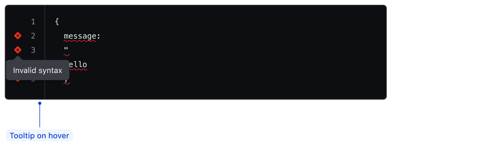
Linting
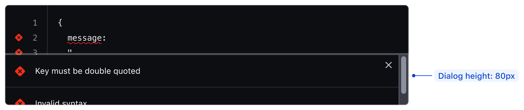
The Code Editor supports linting for JSON using CodeMirror6. This feature highlights all errors with an underline and an icon next to the line number. Each icon has a tooltip explaining the error on the associated line.
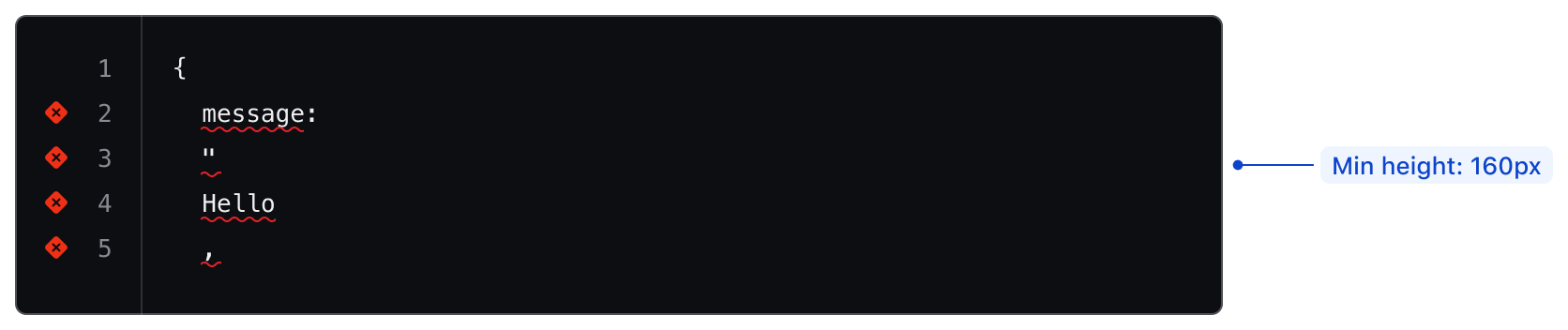
When linting is enabled, the Code Editor will have a minimum height set by default to avoid the alert dialog covering all the content within the editor when opened. The minimum height for the Code Editor with linting is 160px. The linting alert dialog is always 80px in height.
To view all alerts in the editor, open the alert dialog using Ctrl-Shift-m (Cmd-Shift-m on macOS).
If you require linting for additional languages, contact the Design Systems Team.
How to use this component
The code editor is provided as both a CodeEditor component and as an hds-code-editor Ember modifier. To use this component, you must either include the yielded Title component, provide an @ariaLabel, or specify an @ariaLabelledBy.